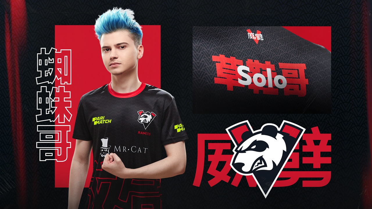
Virtus.pro visual identity for The International 9
Our fanbase in Asia has been steadily growing over the last couple of years. With the first TI in China on its way we want to take another step to get closer to local fans. We are delighted to reveal our special localised brand identity, which will be used exclusively at the upcoming TI. It has been created by our friends at Quberten design studio, who also worked on our updated logo last year.

We have used well known symbols from local culture: red color, Chinese characters and ornaments, and one of China’s main symbols - the giant panda.
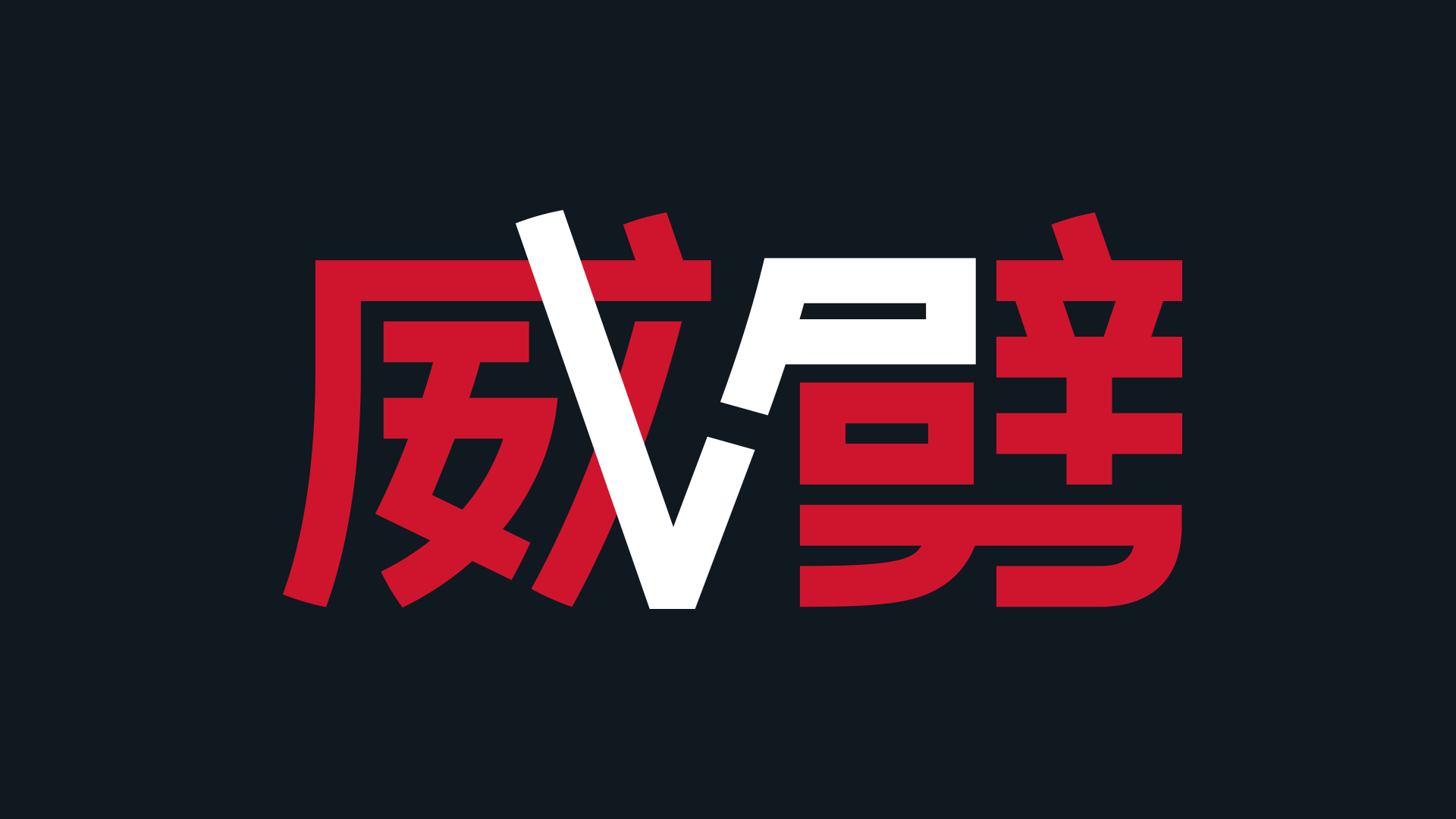
Chinese fans have a special nickname for our team that can be translated as “powerful fight”. We have combined these words with our logo. There’s also a small easter egg for those who are really into details: the Chinese characters have the letters “VP” hidden within them.

Game jerseys pattern is inspired by the contemporary urbanistic style and takes the form of the letter “V”.

The Russian white bear will be replaced by the Chinese giant panda for TI9.

Roman Dvoryankin, Virtus.pro General Manager: «August is full of great news for us. We have launched our Weibo account and a unique visual identity for the main esports event of the year. I hope that our players will show some great Dota play at the tournament as well. China is a strategic market for us, and we’ve tried to pay respect and attention to local traditions».
You can pre-order the game jersey with worldwide delivery on fragstore.com. It will also be available for purchase at the Mercedes Benz Arena in Shanghai during TI playoffs.